How I Reduced Navigation Time by Over 40% for UC Berkeley's EECS Faculty Page
In late 2024, the UC Berkeley EECS website underwent a rebrand. What began as a simple aesthetic update evolved into an effort to improve clarity, usability, and information hierarchy for 100,000+ annual faculty homepage visitors.
Download Slide Deck Here
Project Overview
Role | Collaboration | Tools |
|---|---|---|
Lead UI/UX Designer (Solo Contributor) | EECS External Relations Team | Figma |
WordPress (Kadence Blocks) |
Problem
The existing EECS faculty homepage served a diverse user base of prospective students, journalists, and alumni, but was outdated and featured a flawed information hierarchy.
The page had poorly organized sections and inconsistent visual cues, making it difficult for users to quickly find critical details like publications and contact information. As a result, users took an average of 130 seconds to complete common tasks, over three times the expected industry standard for similar tasks, indicating poor find ability and a frustrating user experience (Umbrex, n.d.).
Solution
I led a comprehensive overhaul of the faculty homepage’s information architecture and user interface to directly address the challenges of poor find ability and overwhelming content. The new design prioritized the key tasks users needed to accomplish, like locating research and contact details by restructuring content hierarchy and introducing expandable sections to reduce cognitive overload.

Built in WordPress using Kadence Blocks, the layout meets WCAG 2.1 AA accessibility standards to better serve users with disabilities, including those with low vision. This solution not only significantly improved navigation efficiency but also enhanced inclusivity, ensuring the page could effectively serve UC Berkeley’s diverse community while reflecting the modern Berkeley brand.
My Unintended First Draft
Finding an opportunity to grow
As a web intern for the EECS Department, I often sought out new projects after finishing my work early. One day, I found a card on our team's Trello board for a project named "Faculty Homepage." This sparked my curiosity, and I asked my supervisor about it.
He explained that old faculty pages needed a visual update to align with the new university rebrand. To get me started, he shared a few examples, briefly reviewing homepages from rival schools along with our allies at UC Berkeley’s Haas.
Old Faculty Homepage
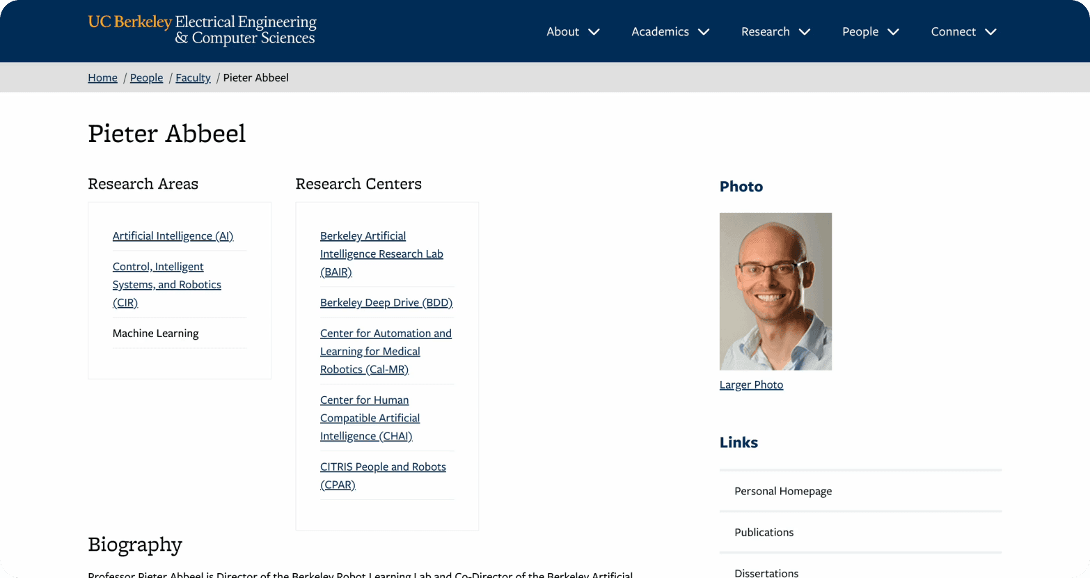
With a new passion ignited, I dove right into a competitive analysis. At this stage, my focus was squarely on visual patterns and aesthetic alignment with the new Berkeley brand without looking at the bigger picture of user needs (just yet).
Competitive Analysis: Focusing on the UI
My analysis, documented in FigJam, centered on what I saw as the visual strengths and weaknesses of each page.

Stanford | MIT |
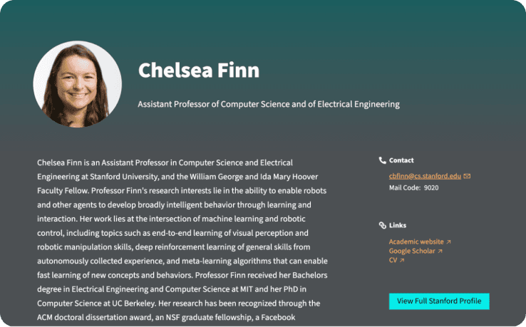 | 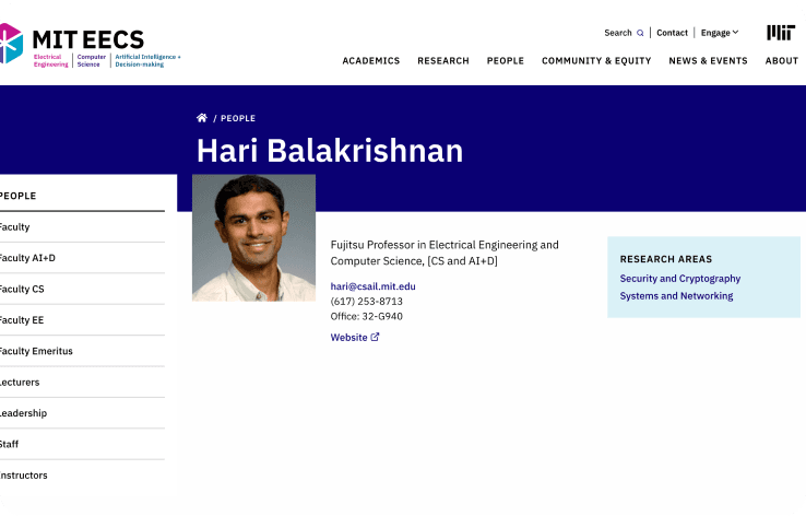 |
✅ Softer and more personal
| ✅ Image positioning
|
❌ Color contrast & Incohesive design style
| ❌ High contrast colors
|
Berkeley Haas | |
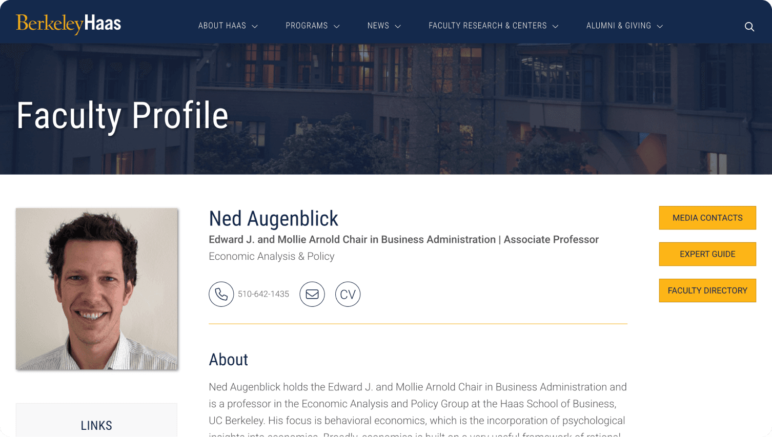 | |
✅ Expandable sections
| |
Drafting My First Solution
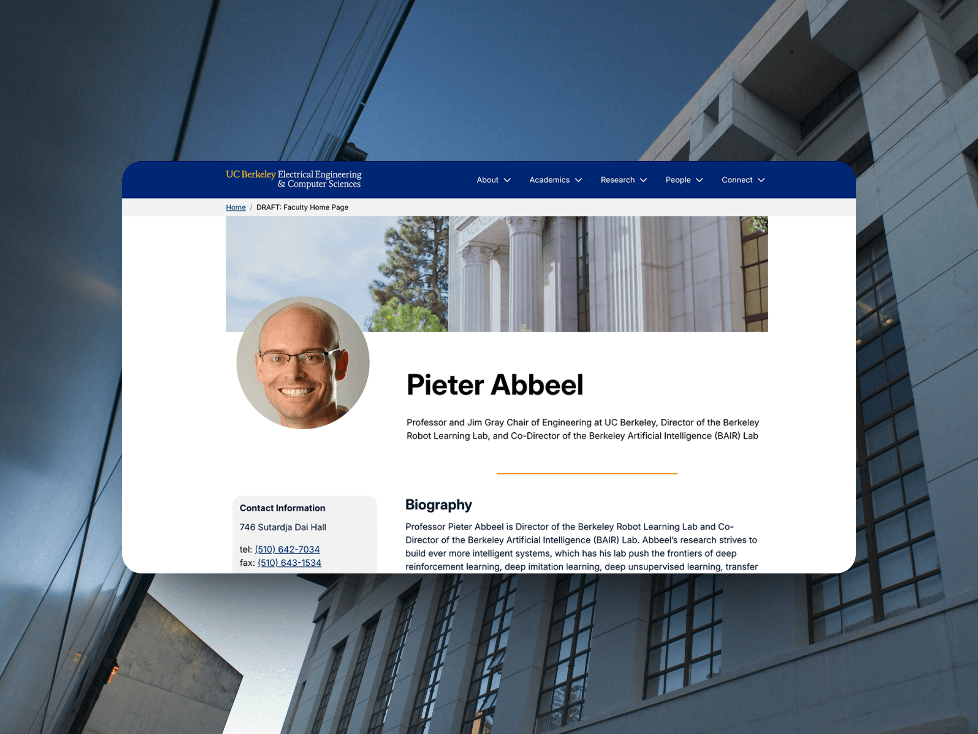
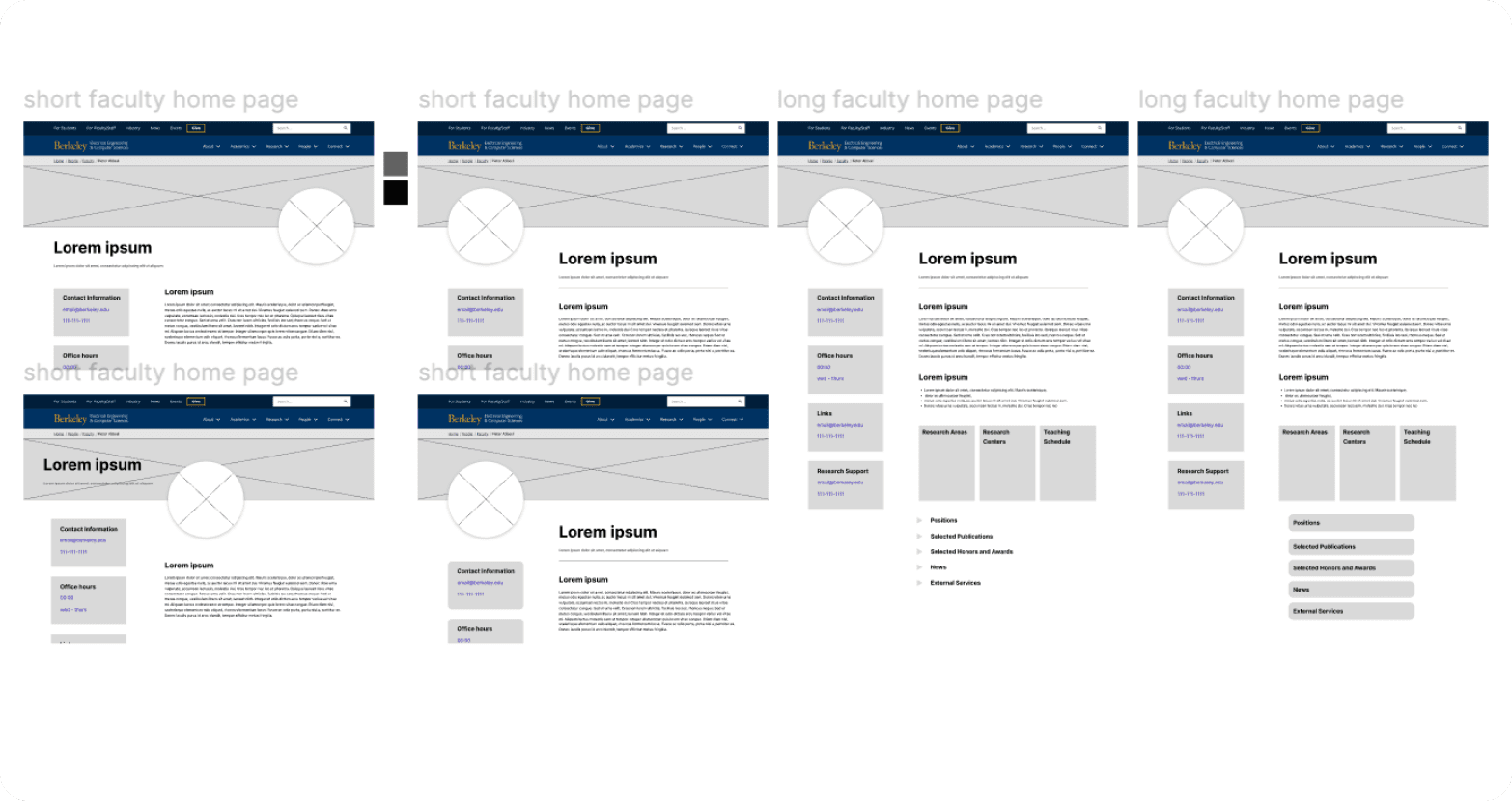
Based on these aesthetic observations, I began drafting my initial designs in Figma. My process started with low-fidelity wireframes, where I explored different layouts by merging what I liked from my competitive analysis. For instance, I explored a layout that combined Stanford’s personal circular image with the Haas page’s expandable sections to create a clean, modern look.
I was so dedicated to this vision that I found myself working outside of my scheduled hours. I eventually realized this might end in burnout and learned a valuable lesson about balancing my passion with a healthy work-life.
After I finished my initial designs in Figma, I presented them in our team’s weekly Zoom syncs. My supervisor and co-Web Intern loved the new direction, and the designs were approved.
Figma to WordPress: Tackling My First Obstacle
When I finally got the green light, I hit my first real obstacle: Kadence Blocks, a brand-new WordPress plugin no one on the team knew how to use.
At first, I was on my own, but I didn’t stay that way long. My Co-Web Intern and I became a learning team, often consulting each other on shortcuts and where to find tools. We even met up during our work-from-home scheduled days just to work through the problems together. It was a crash course in collaborative problem-solving, and it’s how we got through it.

At the time, my focus was almost entirely on delivering a visually polished front-end experience for users. While my Figma files were well-organized, the backend within WordPress presented unexpected challenges. The plugin’s handling of content blocks and layout created a confusing backend environment, full of unnamed sections and inconsistent padding, which made future edits more difficult.
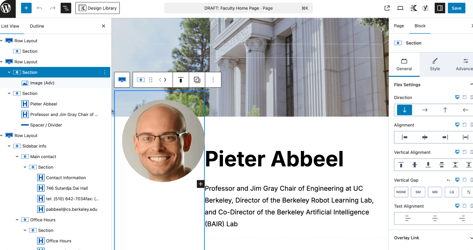
Adding to the challenge, Kadence Blocks lacked a mobile preview feature. I had to design with a vertically-focused layout and rely on my best guess about how it would translate to smaller screens, hoping my choices would work well on mobile without direct visual feedback.
My initial design felt like a success. The layouts were clean and aligned with the university's new brand. After the full UI overhaul, a pivotal conversation I had with a senior designer who occasionally advises me forced me to confront a humbling truth. It was one small sentence, but it stood out to me:
“It looks pretty, but what’s the problem you’re trying to solve?”
The truth was that a beautiful UI is only part of the solution. That question was a turning point. It helped me realize I had focused solely on the visual output without fully understanding what the user was actually trying to accomplish.
User Research
The great pivot from UI to UX
That conversation was a wake-up call. I committed to a radical pivot and began a deep dive into the true user pain points. My focus shifted from aesthetics to usability.
I immediately asked my supervisor about the problem with the existing homepage. He gave me the same answer as before, “it needed a visual update,” but added a new insight: “The goal is for our website to better serve our community.”
This reframe changed everything. The old homepage might have been familiar and functional, but it wasn’t about just fixing a problem; it was about improving the experience for the people who visit the site. When I asked who those people were, I got a surprising answer: “Our audience is quite broad, researchers, prospective students, journalists, alumni, etc.” (EECS at Berkeley, n.d.)
Up until then, I’d always been taught a linear UX process to find a single user persona and design for them. But with such a broad audience, I realized that wasn’t an option. Instead, I pivoted my approach by:
Restructuring the Information Architecture to better serve the diverse needs of our users. | ||
|---|---|---|
Adjusting the Content Hierarchy to prioritize users’ most important needs. | ||
Weaving Accessibility Considerations throughout the process as a foundational principle, supporting a more inclusive experience. |
Usability Testing
As a cognitive science major with no expertise in the EECS field, my lack of prior knowledge allowed me to approach the problem objectively. I knew the best way to uncover true pain points was to measure how people of all backgrounds actually think and interact with the site. I chose to run a series of unmoderated usability tests to understand how a broad audience uses the existing homepage and to measure its efficiency.
I recruited five users and gave them two scenario-based tasks on the old homepage, making sure to have them open the page on various devices for responsive testing.
Task 1: You’re a student interested in this professor’s current research. Try to find out what they’re working on right now." | ||
|---|---|---|
Task 2: "Imagine you’re evaluating this professor for a prestigious academic award. You want to understand their most impressive accomplishments. Try to gather evidence from this page that would support your case." |
Key Findings and Insights
The Design Created Cognitive Overload | |
|---|---|
❌ Finding: 130 seconds was the average time to complete a simple task, over three times the industry standard. | ✅ Insight: The wall of text and poor hierarchy led to user frustration and a high cognitive load, directly impacting efficiency. |
Information Was Buried | |
❌ Finding: A user remarked, "The amount of stuff that was on there confused me, and a lot was going on." | ✅ Insight: Users had a hard time finding the most important information, proving that the existing content was not structured around user goals. |
Diverse User Goals Were Not Met | |
❌ Finding: Users were forced to sift through irrelevant information to find key details like awards or office hours. | ✅ Insight: The one-size-fits-all approach failed to serve a broad audience, as different user types had distinct needs that the page did not prioritize. |
User Interviews
To complement the usability test, I conducted interviews with diverse users to understand their motivations and goals for visiting a faculty page. My key objective was to understand what information they were seeking and why. The interviews revealed three distinct needs from our broad user base:
Prospective Students: primarily interested in the biography section, seeking a personal connection with the professor. | ||
|---|---|---|
Current Students: Focused on finding the professor's office hours and class information. | ||
Parents: More interested in the professor's awards and accomplishments to evaluate their reputation. |
This research confirmed that a single, one-size-fits-all layout would fail to serve our diverse audience. The solution wasn’t to prioritize a single group, but to create a broader, more inclusive design that could effectively serve everyone by acknowledging their different needs.
How Might We…
This research revealed the core UX improvement opportunity and solidified my main HMW Statement:
“How might we help a broad user base quickly find the critical information they need on the faculty homepage?” |
|---|
The Integrated Solution
With core user pain points identified, I didn't abandon my initial designs. Instead, I circled back to my early UI and changed it, using the key insights I had gathered from the user research phase.
This integrated solution balanced the modern, clean aesthetic of my first iteration with the strategic, user-centered findings of my research. My process was to first update the design in Figma and then implement it once again into WordPress using Kadence blocks.
Restructuring the Information Hierarchy
My research revealed that the old information hierarchy buried critical content, leading to lengthy task times. To directly address my HMW statement, I restructured the hierarchy to prioritize user goals and improve findability.
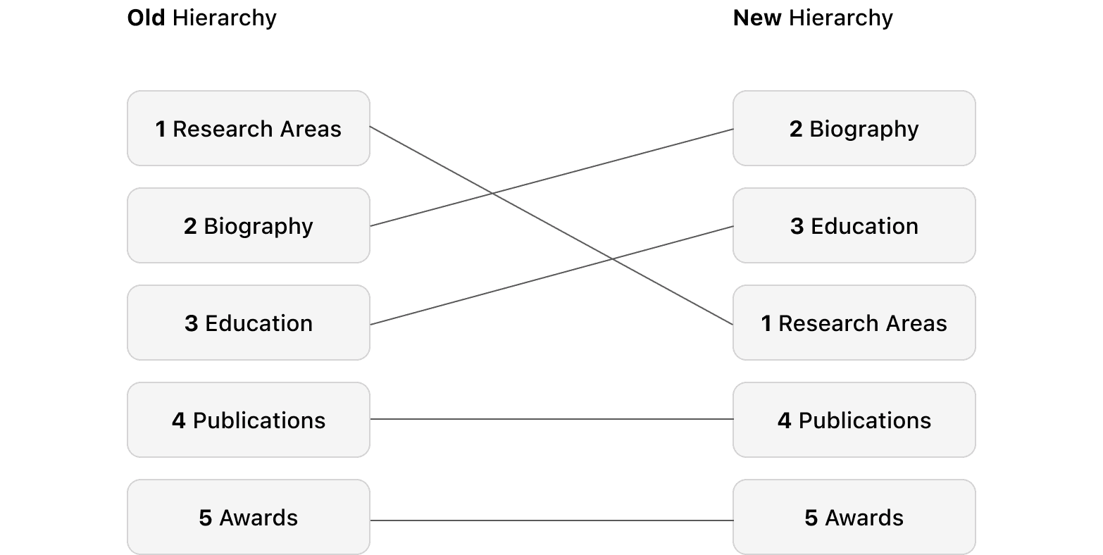
This change was driven by two key user insights:
Biography was moved to the top to provide a personal and familiar entry point for all user types.
Education was positioned second to immediately establish the professor's credibility and authority, a key need for parents and researchers.
This new hierarchy directly reduced the cognitive load on the user and streamlined the path to the most sought-after information.
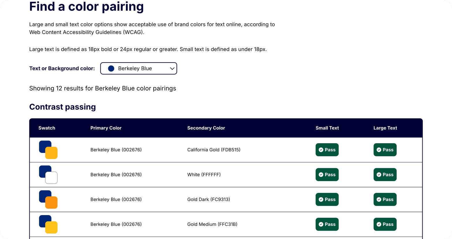
Contrast Accessibility
To ensure my solution served our broad user base, I re-evaluated my design through the lens of accessibility. Understanding the importance of this principle, I heightened my focus on WCAG 2.1 AA compliance. I constantly used Berkeley's brand-provided contrast checker to ensure my color palette was accessible, and I implemented descriptive alt text for all key images.
Chapter 04: Reflection
The Outcomes
Based on post-project usability testing, the final solution successfully streamlined the user journey, reducing the average task completion time from 130 seconds to 78 seconds, a 40% improvement. With over 100,000 users annually, this translates to hundreds of hours saved across the department’s stakeholders.
Importantly, the new design also meets WCAG 2.1 AA accessibility standards, making the site more inclusive for users with disabilities, including those with low vision. This commitment to accessibility ensures that a broader and more diverse community can efficiently navigate and benefit from the faculty pages.
My design is scaled into a template for other faculty pages, extending these usability and accessibility improvements across the department.
Don’t Be Afraid To Go Back to the Cutting Board
I never would have expected that finding a new way to pass time after finishing my daily tasks would eventually change my perspective on UI/UX Design. The experience yielded far more than a potential prize; it was a crucible for significant personal and professional growth.
This project cemented my design philosophy: that empathy and structure must drive aesthetics. I now lead with UX thinking, apply rigorous testing, and follow through with polished implementation no matter the learning curve.
This project taught me invaluable lessons in:
Navigating New Software: Learning how to use tools like Kadence Blocks in WordPress on the fly. | ||
|---|---|---|
Accessible Design: Making sites more accessible to a broad user base. | ||
Process Adaptability: Understanding that the UX process is not always linear. | ||
Critical Thinking: Learning to be critical of my own designs and not be afraid to go back to the drawing board to build a better solution. |
Next Steps?
Since the site is fully implemented, I would like to conduct further usability testing and collect feedback from a new round of real users. These insights will allow me to refine my designs and ensure the site continues to effectively serve the EECS community.
Additionally, I am prepared to adapt the design if the results don’t meet expectations. If usability testing reveals new challenges or less improvement than anticipated, I would analyze user feedback to identify pain points and adjust the information hierarchy or interaction design accordingly. This iterative, data-driven approach will help continuously optimize the experience for our diverse audience.