How I Used AI to Grow Subscribers by 166%
SMBmarket tasked my team with redesigning the marketplace experience. I introduced AI-generated listing images to help sellers without professional photos stand out among 85,000+ listings, while redesigning the buyer-facing marketplace with visual filters and cognitive science-backed card layouts to guide first-time buyers.

Download Slide Deck 1 Here
Download Slide Deck 2 Here
Project Overview
I led the research and design for the marketplace page, analyzing SMBmarket’s three-sided marketplace using AI tools while collaborating with UX Engineers to make sure designs were feasible for our clients and for implementation and handoff.
Role | Team | Tools |
|---|---|---|
Senior UX Designer | 4 Senior UX Designers | Figma |
Cell 2-1 | 3 UX Engineers | Chat GPT |
Claude |
Scenario
A buyer wanting to buy a donut shop but doesn’t know where to start, a seller wanting to sell a donut shop but has no attractive images, and a company that makes inputting images into their website mandatory to sell.
Problem
Buyers didn’t know how to navigate the site, using visuals to guide their decision and catch their attention, sellers wanting to stand out in SMBmarkets pool of 85,000 listings but lacked a professional photo that describes their business well enough, and SMBmarket who lacked the understanding of this side of the dice.
Solution
AI generated images that scanned the description of sellers’ listings and made images that capture it. A small change backed by research that supports all three sides of the dice influencing an influx of 1,000 new subscribers to SMBmarket calculating to a 166% increase after my team’s UX additions were implemented to the site.
Initial Client Call
SMBmarket was focusing one only one user, the buyer without understanding the seller.
When my team and I joined the first client call, the problem they brought to us was that they wanted to help first time buyers. A blurry problem statement centered around first time buyers. They want faster onboarding and retention. They wanted us to add features such as a deal calculator that had compatibility.
Clearing up the client needs
I knew that there were different layers to the problem that the client mentioned. It was up to my team to unravel it and piece it apart to the core. We did our first meeting and what I wanted from this meeting were 3 things:
understanding their priority- my team only had 3 months to work on this project, and balancing academics and other extracurricular activities, we had to allot our time to the most important first
understand what SMBmarket does exactly
Find their main problem
However, my team members did things differently. They diverged. They went through the website with no plan in mind, just listing out things that were bad “text heavy”, “why is this button this color?”, “i’m pressing this button but its not working”. Initially, I tried speaking out about my idea on how the meeting should go. “we need to find the problem first before looking through the website”, “we need to figure out what their priority is” I realized that what they were doing was just as fundamental to what I wanted out of the meeting too. Diverge in order to understand the problem, so I joined them. But additionally I added that we needed to figure out what we need to do because adding in too many features could be costly. After my team’s first get together, we rounded up our priority list.
save list/item/alert feature
“I want to be able to allow users to view all their deals in one place. A deal pipeline where all their saved deals can be viewed and compared against each other, as well as keeping specific characteristics of the deal like "interest", "phase in deal", etc”
all listing page
“some preview of the business listing in the landing page. To give potential users a sense of what’s available.”
Product landing/preview page
“Create landing page so that users know what the product is like before purchasing”
Navigation bar items
“move search bar up, delete photo”
My PM had each member choose a page they were interested in working on and I decided to choose the all listing page (marketplace page) because even though every page makes an impact on the users, i think i had a vision as to how to improve the ux of the marketplace page the most. so although it wasn’t the landing page, the one that everyone would see, i went with the marketplace page instead.
User Research
I didn’t know a single thing about how to buy a business. I made everyone a FigJam and we did the basic competitor analysis, but it felt too surface-level. So I went to different forums online where people would talk asking for advice from the public. I learned:
How first-timers actually talk and the terminology they use.
The "Top 3" things seasoned buyers look for.
Their advice and the pain points they actually went through.
In addition to this secondary research, my team conducted qualitative research on beta users to understand what they look for as well and what works well for them on the site.
Iteration
The first thing people see are visuals, not words. Based on my CogSci behind UX class, I knew people interact with images better. We decided to add images. We almost added an "off" switch for images, but scrapped it because the data showed people just want the visuals.
I started with rectangular shapes, but found they forced the eye to scan too much horizontally. I experimented with where to put labels and the "Details" button to see what felt most natural.
I moved toward a taller, denser layout. I played with putting high-level metrics like EBITDA, Cashflow, and Revenue into clear boxes so buyers could compare businesses at a glance without reading a wall of text.
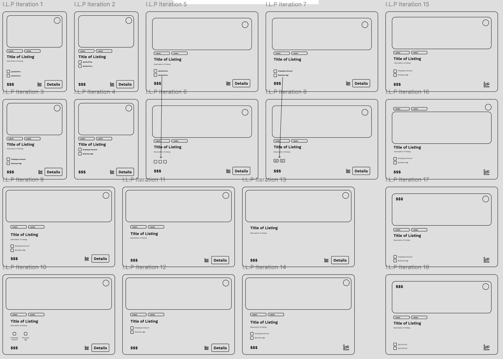
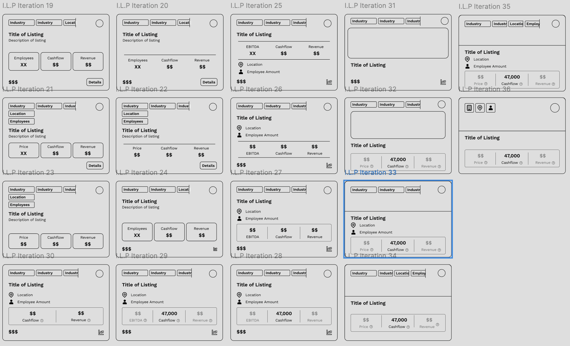
The final marketplace design implemented my "Cognitive Science" approach. Instead of a blank search bar, we gave users specific filters and visual cues.
The default page the user sees after logging in, so that they can go straight to searching/browsing for businesses. Holds listings in grid card format that the user can search/filter/browser through
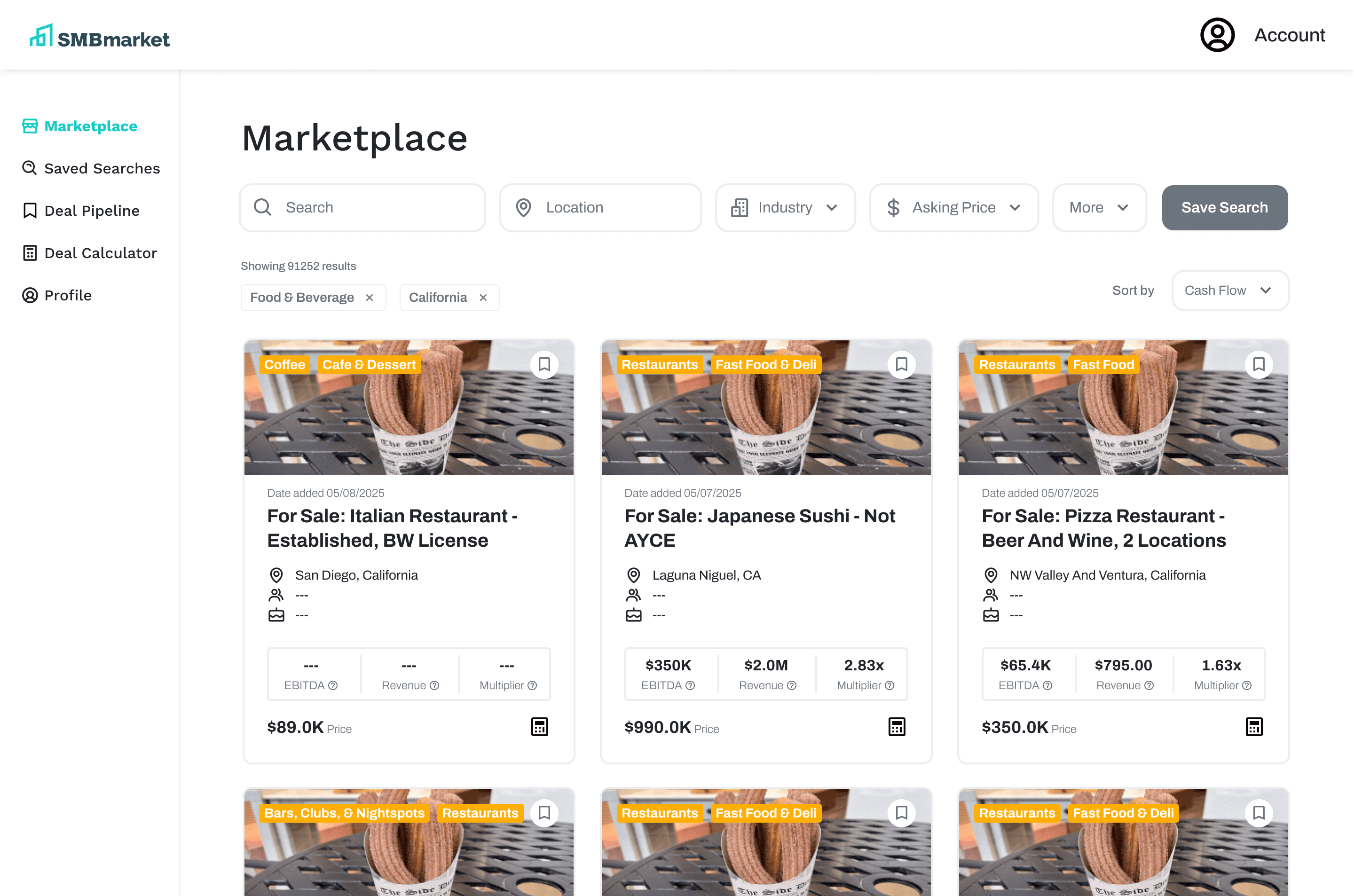
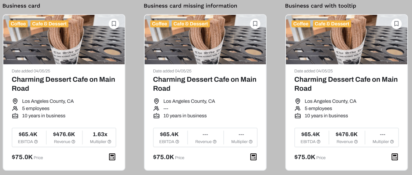
Business card:
At the top: AI generated image relating to business, industry tags, and save button which when click will save that business to deal pipeline
Stat metrics will have hover-able tooltips describing the metric
Calculator bottom at the bottom right will add business information to deal calculator
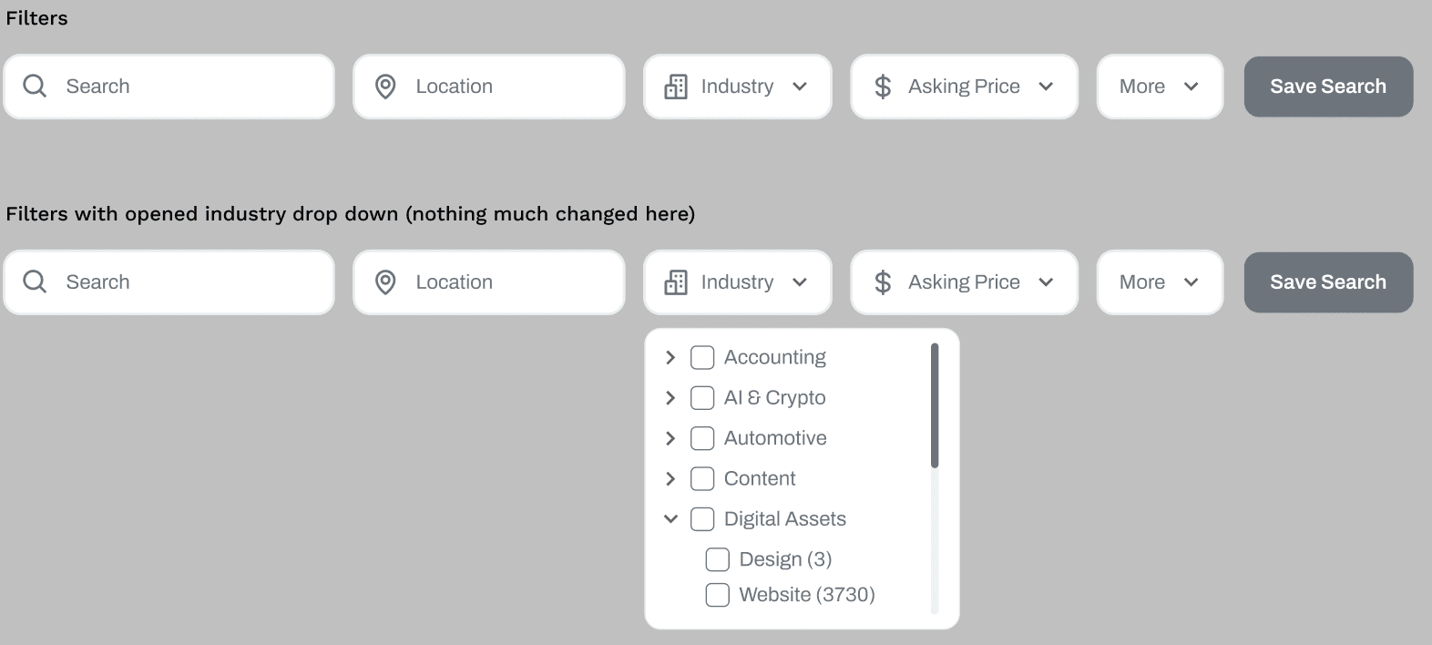
Filters:
Filters largely the same as before, with the main change being having Asking Price to have its own dropdown instead of it only being accessed through More Filters
Updated copy for more clarity/succinctness:
“Keywords” → “Search”
“Select Locations” → “Location”
“Select Industries” → “Industry”
“More Filters” → “More”
The “More” dropdown would open a modal displaying all filter options
Save Search button would save the set of currently set filters to Saved Searches page
Working with UX Engineers
This was my first time working with engineers and my original plan was to add in a working search bar to the landing page with my designs but my UX engineers said that developing that would take too much time with our little time frame. After this discussion, I kept in mind feasibility in my designs moving forward.
Final Deliverable
Our client did not know how figma worked so my team and I cleaned up our files and added in annotations in order to make it understandable to him. Our client implemented nearly all of our designs into their website and garnered over 1,000 new subscribers in just a few months.
Reflection
This was the first time I worked with UX engineers. I understood how designs needed to actually be feasible in order for it to be implemented. Another thing I paid attention to for the first time was the fact that one design change and action changes all the users, not just one. I learned to see design as a multisided dice and made it efficient for three types of users, not just the one that the client wanted.